Loading
Website Screenshot Generator - Capture Any Webpage Online
Take a screenshot of any webpage online in seconds - no extension, no download. Choose a Mobile, Tablet, Monitor, or custom viewport, capture the visible area or the full page top to bottom, export as PNG, JPEG, or WebP, and clean up the capture with dark mode, ad blocking, and cookie-banner removal. Capturing needs a free account - your settings are kept while you sign in.
Your screenshot appears here
Set your options and run the capture.
How to use this utility?
Going from URL to screenshot takes under a minute, from pasting the address to downloading the image.
Step 1 - Enter the target URL
Paste the full address of the page into the Website URL field, including
https:// or http://. The page must be publicly reachable - pages behind a login or on a private network will not render. For example: https://ipgeolocation.io/pricingStep 2 - Choose your viewport
Select from four viewport options:
- Mobile - simulates a smartphone screen.
- Tablet - simulates a tablet screen.
- Monitor - simulates a standard desktop or laptop screen. This is the default.
- Custom - enter a browser width (up to 3,000 px) and height (up to 5,000 px). Optionally, lock the dimensions to a standard aspect ratio: 16:9, 4:3, 1:1, 3:4, 9:16, or 9:19.5.
Step 3 - Select your output format
Choose between PNG (default), JPEG, or WebP depending on your use case. PNG gives you lossless quality; JPEG offers smaller file sizes; WebP is a modern alternative that balances both.
Step 4 - Configure advanced options
Toggle any of the following switches to customize what the headless browser loads before taking the screenshot:
- No Cookie Banner
- Enable Caching
- Block Ads
- Block Chat Widgets
- Block Tracking
- Dark Mode
- Full page
Step 5 - Capture the screenshot
Click Capture Screenshot. If you are not signed in yet, the results panel keeps your settings and asks you to sign in. Use your free APIFreaks account - new accounts get 10,000 credits, no credit card - and the capture runs straight away with the options you chose.
Step 6 - Review and download
Inspect the preview. If it looks the way you need, click the Download button to save the file to your device in the format you selected.
What Is the Website Screenshot Generator?
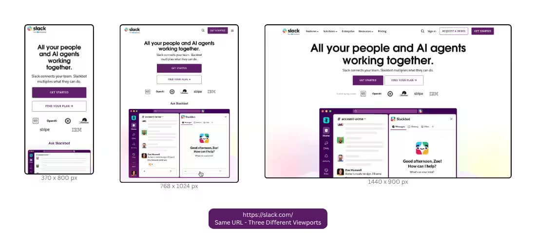
Resizing your own browser window never quite shows what a phone visitor sees, and your extensions, cookies and login state end up in every capture. The Website Screenshot Generator loads the URL in a clean headless browser at the viewport you pick, runs the page's JavaScript, and returns an image of exactly what fits in that frame.
Pick Mobile, Tablet or Monitor to compare a mobile website screenshot with the desktop view, or set a custom browser size up to 3,000 px wide and 5,000 px tall. Tick Full page to capture the whole page from top to bottom instead of just the visible area. Then export the capture as PNG, JPEG or WebP. Toggles strip cookie banners, ads, chat widgets and trackers before the capture, and Dark Mode shows the page’s dark theme where the site has one.
It is a website screenshot tool built for designers checking responsive layouts, QA engineers documenting a bug at a specific screen size, and marketers collecting clean competitor captures. Everything runs on this page with a free APIFreaks account - signup includes 10,000 credits, no credit card.
What would you get from it?
When you run the Website Screenshot Generator, you receive a rendered image of the requested webpage, displayed directly in the tool interface - no waiting for an email, no file to manually download unless you choose to. Here's what the tool delivers:
Viewport Accurate Rendering
You choose the browser size the page loads at - Mobile (smartphone-sized), Tablet, Monitor (full desktop), or Custom, where you set a width up to 3,000 px and a height up to 5,000 px and can lock them to one of six aspect-ratio presets. By default the screenshot shows what that viewport displays; tick Full page to capture the whole page from top to bottom at that same width.
Three Output Formats
Save your screenshot as a PNG (the default, with lossless quality), JPEG (smaller file size, ideal for quick sharing), or WebP (modern format with excellent compression-to-quality ratio). The choice is yours, depending on how you plan to use the image.
Advanced Rendering Controls
A set of toggle-able options gives you fine-grained control over what the browser loads and how it behaves before the screenshot is taken:
- No Cookie Banner - strips intrusive cookie consent prompts so they don't obscure the page content.
- Block Ads - removes banner ads, interstitial overlays, and advertising scripts for a cleaner visual.
- Block Chat Widgets - hides live chat popups and support widgets that often float over the main content.
- Block Tracking - prevents third-party tracking pixels and analytics scripts from loading.
- Enable Caching - speeds up repeated captures of the same URL by serving a cached render.
- Dark Mode - triggers the page's dark mode styles (where supported), useful for testing UI themes or capturing dark-mode-specific designs.
Instant Preview & Download
The screenshot appears in the results panel beside the form, and one click downloads it in the format you picked. If you set up a capture before signing in, the tool keeps your URL and options, and the capture runs as soon as you are signed in.
Use Cases
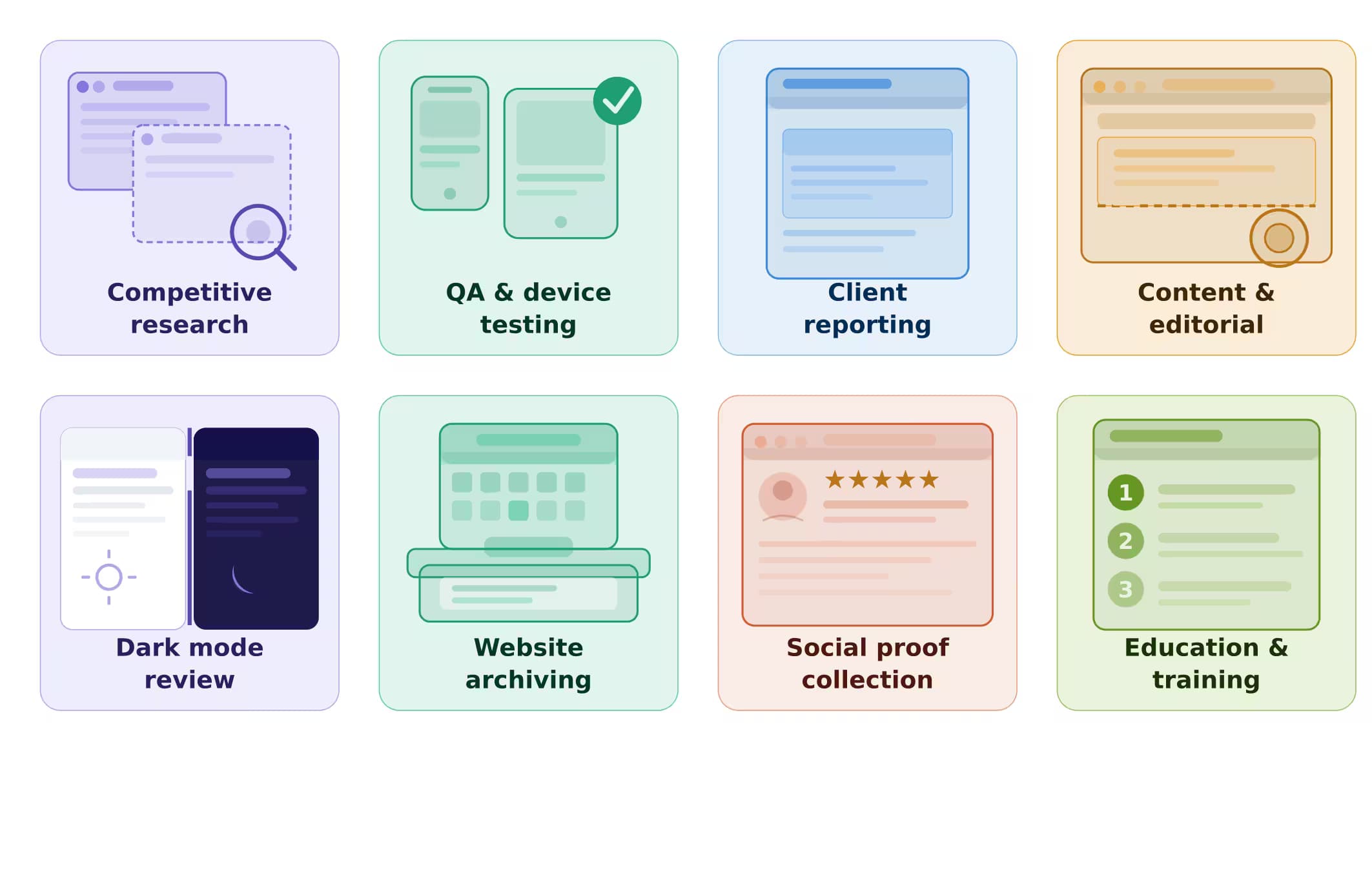
The tool serves a surprisingly wide range of professionals, teams, and workflows. Here are the most common use cases:
Competitive Research and Benchmarking
Marketing teams and growth strategists regularly capture screenshots of competitor websites, landing pages, pricing tables, and checkout flows. The ability to block ads, cookie banners, and chat widgets means you capture the core page layout without visual clutter - making comparisons cleaner and faster.
QA and Cross-Device Testing
Developers and QA engineers use the viewport options to visually verify how a web page renders at different screen sizes. Instead of manually resizing a browser window or maintaining a bank of physical devices, they generate a Mobile, Tablet, and Monitor screenshot back to back and spot layout regressions instantly.
Client Reporting and Design Documentation
Agencies and freelancers attach website screenshots to project reports, client decks, and design handoff documents to record how a site looked on the day of the review. Using the Custom viewport and aspect ratio options, they can produce images that fit presentation templates without cropping.
Content and Editorial Teams
Journalists, bloggers, and content creators capture screenshots of sources, product pages, and web tools to use as visual references in articles and tutorials. The No Cookie Banner and Block Chat Widgets options are especially useful here - they eliminate the noise that would distract readers if the screenshot were published.
Dark Mode Design Review
Designers testing dark mode implementations across third-party or client sites use the Dark Mode toggle to see the page render in its dark-mode state without needing to change their OS or browser settings manually.
Website Archiving and Monitoring
Operations teams and compliance officers capture periodic screenshots of web pages as part of audit trails, regulatory documentation, or general visual archiving - maintaining a visual history of a page's content and layout over time.
Social Proof and Testimonial Collection
Product and marketing teams screenshot positive reviews, press mentions, and social posts that appear on third-party platforms, creating shareable visual assets without needing to save links that might later break.
Education and Training
Trainers and instructional designers screenshot web-based tools and interfaces for step-by-step guides, onboarding documentation, and e-learning course materials.
How It Compares
If you've ever searched for a way to capture a website screenshot, you've probably encountered at least three types of solutions. Here's how the APIFreaks Website Screenshot Generator fits into the landscape:
Browser extensions (like GoFullPage or Nimbus Screenshot) run inside your own browser. They capture what you personally see - which means your login state, browser extensions, local cookies, and network connection all affect the result. They are quick for personal use, but they are not repeatable or shareable in a consistent way.
The APIFreaks Website Screenshot API is built for developers. If you are building an application that needs to generate screenshots programmatically - on demand, at scale, or triggered by events - the API is the right tool. It accepts the same parameters as the utility but returns the image via a REST API response, making it easy to integrate into pipelines, dashboards, and automation workflows.
The Website Screenshot Generator utility is the middle ground: a professional-grade tool with no coding required. It renders pages in a real headless browser (outside of your personal browser environment), giving you consistent, reproducible results. Advanced options let you control the render before capture - something neither a simple browser extension nor a manual screenshot can match.
| Features | Browser Extension | Screenshot Generator (this tool) | Screenshot API |
|---|---|---|---|
| No code required | ✅ | ✅ | ❌ |
| Runs in headless browser | ❌ | ✅ | ✅ |
| Consistent or repeatable | ❌ | ✅ | ✅ |
| Block ads or cookie banners | Limited | ✅ | ✅ |
| Custom viewport | Limited | ✅ | ✅ |
| Full-page capture | Limited | ✅ | ✅ |
| Automation or bulk use | ❌ | ❌ | ✅ |
| Download in PNG, JPEG, or WebP | ✅ | ✅ | ✅ |
| Webhook delivery | ❌ | ❌ | ✅ |
Frequently Asked Questions
No. This online screenshot tool runs on this page. The URL is rendered in a headless browser on APIFreaks servers and the webpage screenshot comes back to your browser, so there is no extension, desktop app, or code to set up.
Anyone with a free APIFreaks account. Signup includes 10,000 credits and needs no credit card or paid plan. You can set up a capture before signing in - the tool keeps your URL and options and runs the capture once you are signed in.
The tool works with any publicly accessible URL - websites, web apps, landing pages, documentation pages, product pages, and more. Pages behind authentication (login walls), pages on local/private networks, or pages that block bot traffic may not render correctly.
PNG produces a lossless image - ideal when you need pixel-perfect quality for design or documentation purposes. JPEG uses lossy compression, resulting in a smaller file that is easier to share but with a slight reduction in sharpness. WebP is a modern format developed by Google that achieves high-quality images at significantly smaller file sizes than both PNG and JPEG, and is natively supported by all major modern browsers.
When enabled, the headless browser uses a predefined script to detect and remove cookie consent banners before the screenshot is taken. This is helpful when you want to capture the actual content of the page without an overlay blocking it. It works on most cookie consent frameworks, though very custom implementations may not always be removed.
Block Ads removes visible ad elements - banner ads, interstitial overlays, and advertising content - from the rendered page. Block Tracking prevents third-party tracking pixels, analytics scripts, and data collection scripts from loading. Both can be used independently or together.
Yes. Select the Custom viewport and enter a browser width up to 3,000 px and a height up to 5,000 px. You can also lock the dimensions to one of the six built-in aspect ratios (16:9, 4:3, 1:1, 3:4, 9:16, or 9:19.5), which helps when a screenshot has to fit a social media format or a presentation slide.
Six aspect ratio presets are available: 16:9 (widescreen), 4:3 (standard), 1:1 (square), 3:4 (portrait), 9:16 (mobile portrait), and 9:19.5 (tall mobile). For social media, set the Custom viewport to 9:16 or 9:19.5 before capturing - these match Instagram Stories, TikTok, and Snapchat. Use 1:1 for square social posts and 16:9 for presentation slides or video thumbnails.
When caching is enabled, the tool may return a previously rendered screenshot for the same URL if one is available in the cache. This speeds up repeated captures of frequently checked pages. When caching is disabled, the tool always renders the page fresh from the live URL, which ensures you are seeing the most current state of the page.
Dark Mode works on websites that implement CSS prefers-color-scheme: dark media queries or JavaScript-based theme switching that responds to the OS/browser dark mode preference. Websites with hardcoded light-mode styles will not visually change when this option is enabled.
Yes. Once the screenshot appears in the preview panel, a Download button is available. Click it to save the image to your device in the format you selected (PNG, JPEG, or WebP).
Each capture draws credits from your APIFreaks balance - the same balance used by every APIFreaks API. New accounts start with 10,000 free credits, and no paid plan is needed to use the tool. Your remaining balance is shown in the account dashboard.
Yes. The Website Screenshot Generator is a graphical utility built for humans - you interact with it through a UI, configure options visually, and get an image you can download. The Website Screenshot API is designed for developers who want to generate screenshots programmatically within their applications and workflows. Both tools use the same underlying rendering engine, so output quality is equivalent.
Yes. Tick Full page and the capture runs from the top of the page to the bottom instead of stopping at the visible area. The width still comes from the viewport you picked, so a Mobile full-page capture is a tall, narrow image of the whole page. Leave it unticked to capture only what fits in the viewport. Long pages take longer to render.
The tool loads the page in a fresh headless browser with no cookies, saved logins, or extensions, at the exact viewport you selected. Your own browser may show a logged-in view, remembered consent choices, or a different window size. Sites that show different content by region, or that block automated browsers, may also render differently.